Civic Legal Aid
Redesigning the Legal Aid User Journey
Client: UK Ministry of Justice, London
Sector: Public Services / Legal Tech
Role: UX & Service Design Lead
Role: UX & Service Design Lead
/background(fff)/1100x777.jpeg?auto=webp)
The service needed to be simplified, humanized, and digitally supported.
USER PROBLEM
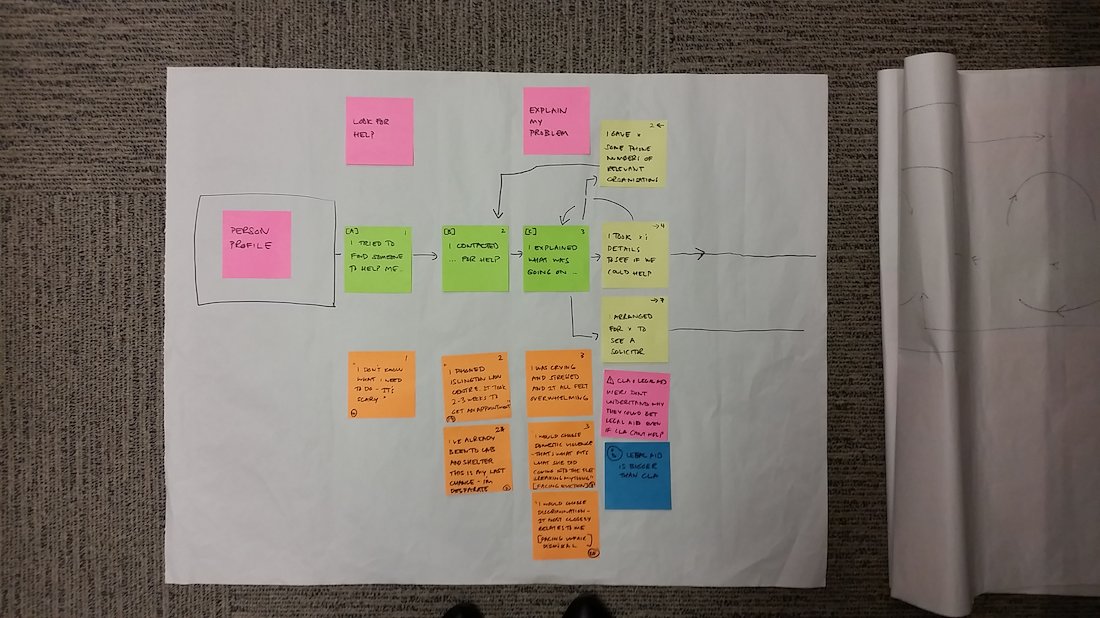
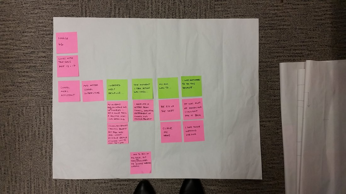
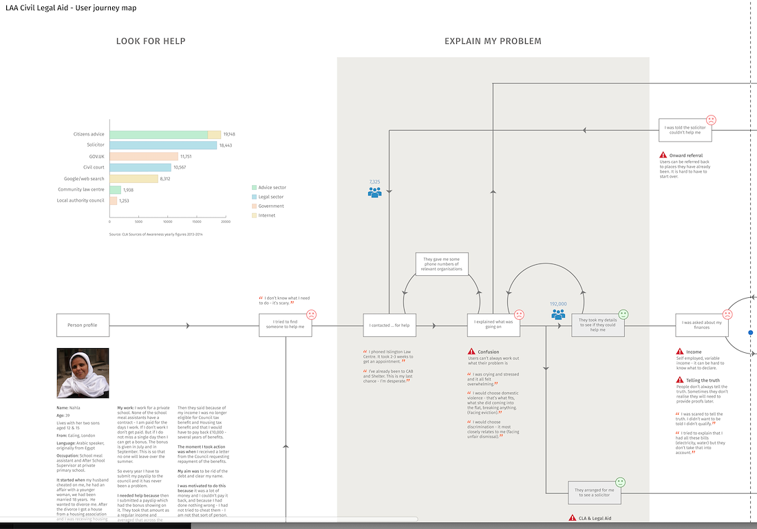
The personas, particularly “Nahla,” a mother facing a housing benefit dispute, illustrated core user pain points:
• Lack of clarity on how and where to get help
• Confusion around eligibility (income, benefits, and case merits)
• Emotional overwhelm when explaining their problem or facing legal processes
• Anxiety around financial assessments and fear of being rejected or accused of fraud
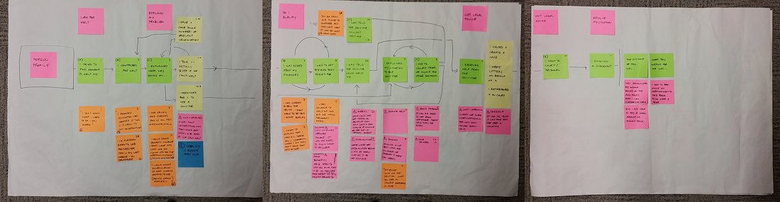
These themes emerged through journey mapping, co-design workshops, and narrative sticky-note sessions (Images 2–7), capturing authentic user voices and emotional states.
DESIGN CHALLENGES IDENTIFIED
• Entry Point Friction – Users struggle to find where to start; support is hidden behind legal jargon or offline systems.
• Complex Qualification Criteria – Income, benefits, and case merits form a confusing matrix that users (and sometimes staff) can’t easily navigate.
• Cognitive Overload – Users feel overwhelmed trying to recall and provide necessary documentation and timelines.
• Looping Pathways – Users often circle back due to unclear instructions or being prematurely disqualified.
• Emotional Toll – Shame, fear, and stress hinder truthful disclosure, affecting outcomes.
UX & SERVICE DESIGN APPROACH
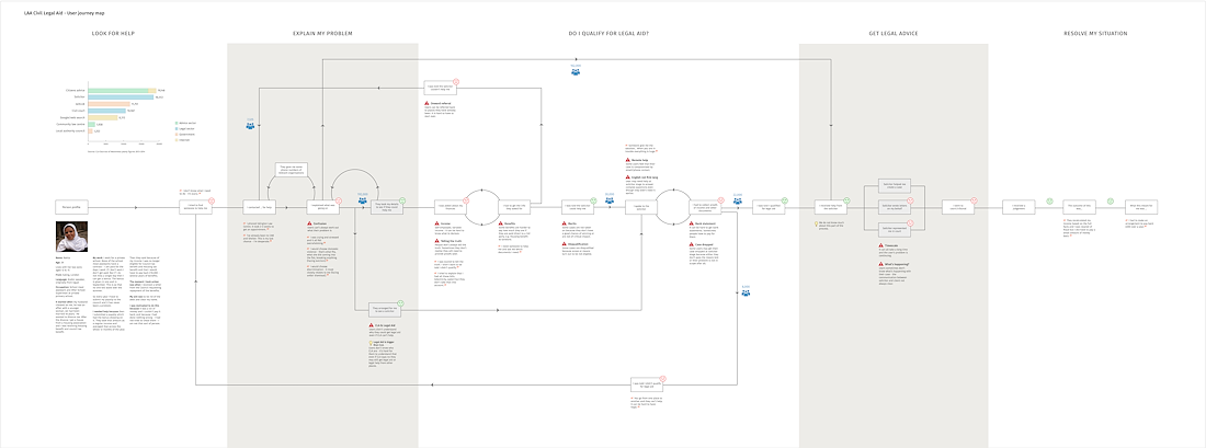
Using the high-fidelity journey map (Image 1) and research wall (Images 2–7), the team introduced several key services and UX improvements:
1. Reframe the Journey into Clear Key Phases
Look for Help → Explain My Problem → Do I Qualify? → Get Legal Advice → Resolve My Situation. This helped department staff and decision makers visualize and understand end to end progress and next steps from users' point of view.
2. Decision-Support Tool Design
Introduced guided digital triage to help users pre-qualify based on real-time logic, removing guesswork.
3. Plain Language and Emotional Framing
Rewrote user-facing content with clarity and empathy: "What this means for me…" was preserved in digital forms and scripts.
4. Feedback Loops and Status Clarity
Visual indicators and notifications to let users know where they are in the process and what's expected next.
5. Support for Disclosure
Emotional safety prompts like “It’s okay not to have everything right now” helped users disclose difficult financial situations.
Targeted Impact
• Reduced case drop-offs by helping users stay on the path with proactive digital nudges.
• Increased eligibility conversions through clearer qualification logic and upfront feedback.
• Improved trust and user satisfaction by acknowledging emotional burdens and designing for transparency.
• Enabled scalability of legal services by reducing in-person dependency.